Have you checked out our Slideshows & Presentations page? If you are an EGA member, you will be able to access a growing list of slideshows showcasing amazing embroidery on that page. If you’re not a member yet, you can browse a selection of video series also available on that page. Get instant access to all the slideshows, plus a collection of over 60 Petite Projects and more, by joining us here.
The latest addition to our Slideshows & Presentations page is a presentation about Color by Carol Lynn Stratton, designer and EGA member from our Canton Chapter in Ohio. This presentation takes you through the basics of Color Theory and shows you embroidery examples focusing on color value, intensity, hue and harmonies. This presentation is a great tool to assist you when selecting colors for your projects, and to provide you with tips on working with colors. Visit our Petite Projects page for members where you can also get Colorplay I and Colorplay II, two projects by member Erica M. Cannon to help you further your knowledge of color theory.
If you are looking for a more advanced look at Color Theory, check out our Individual Correspondence Course Rainbows Bend: A Course on Color Theory with Carole Rinard.
We thank Carol Lynn for donating this presentation for the benefit of EGA chapters and members everywhere. Each slideshow also includes a link to download a PDF with slide descriptions which will help chapters wanting to share the presentation as a chapter activity.
Enjoy a small selection of the slides below and visit the slideshow here to see the entire presentation.
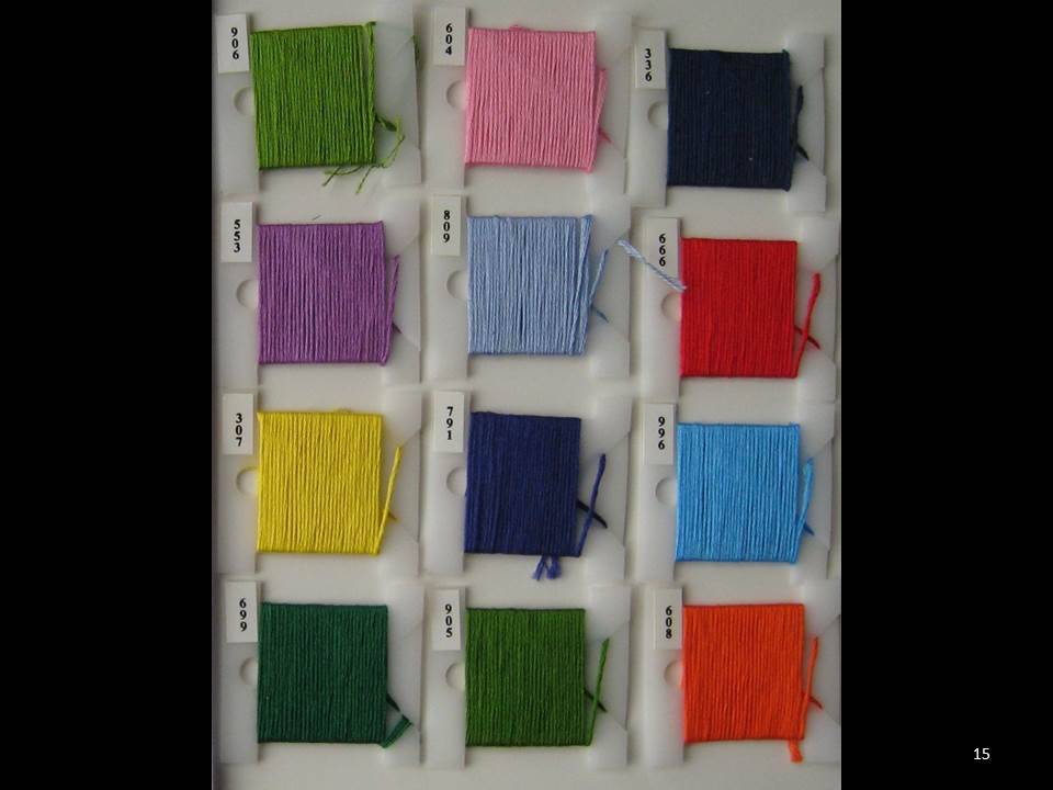
Color by Carol Lynn Stratton - 1515. L, M, D colors: Value is the lightness or darkness of a color. Pick three lights, mediums and dark value numbers. Any hesitation?
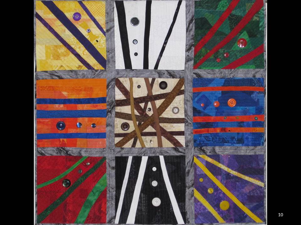
Color by Carol Lynn Stratton - 1010. 9-Patch color wheel: Generally going directly across the wheel from a hue you get to the opposite hue or complimentary hue. Complimentary colors [hues] contain all three primary colors. For example, red is the complimentary color of green [a mix of blue and yellow]. Complimentary colors intensify each other when place next to each other. As you gradually add one hue to it’s opposite hue the color becomes grayer or neutral in the center of the wheel.
Temperature—the colors on the top half of color wheels are considered warm colors. While the colors on the bottom half are considered cool colors. In the above 9 patch it would be the colors on the left are warm and on the right are cool.
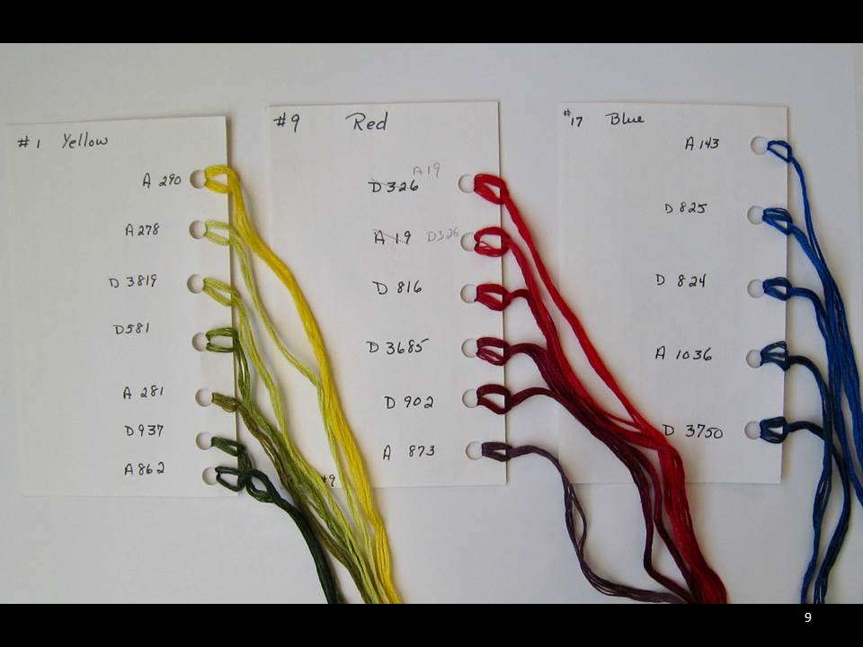
Color by Carol Lynn Stratton - 99. Primary scales: Each numbered ‘stick’ is repeated on a card with the thread DMC or Anchor corresponding numbers.
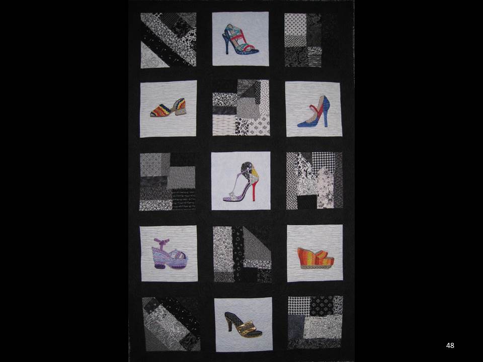
Color by Carol Lynn Stratton - 4848. Shoe Quilt: The End
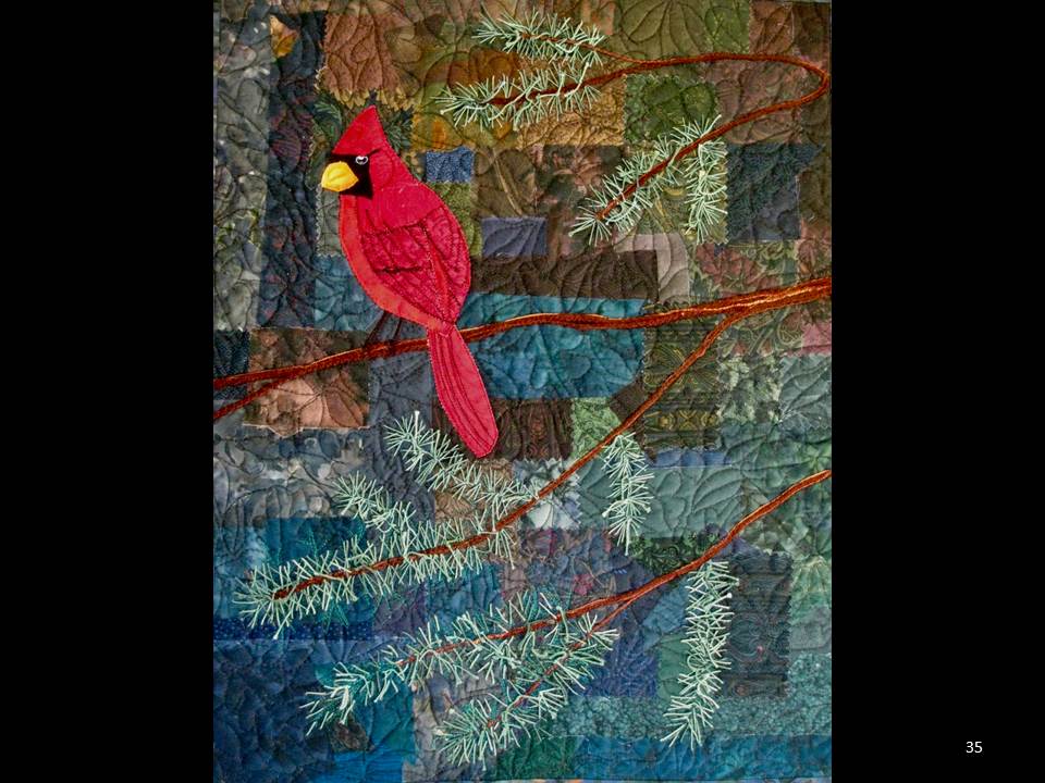
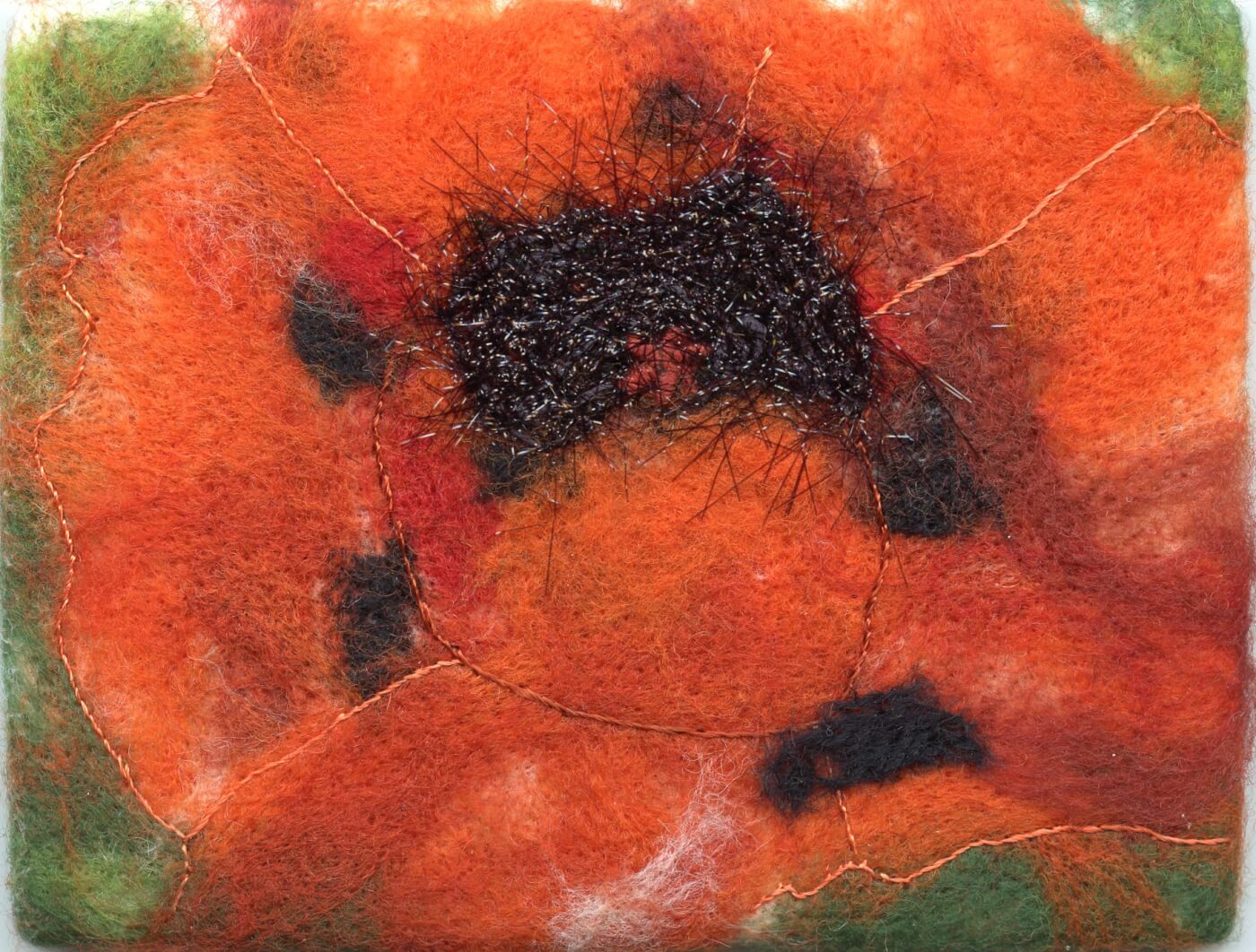
egaslides color clstratton 3534. Poppies; 35. Season’s Greetings, 36. Sweet-gum by the Firs:
Complimentary: a work using predominantly two colors opposite each other on the color wheel. Blue and orange in the poppies, green and red for Season’s Greetings, and Sweet-gum by the Firs.
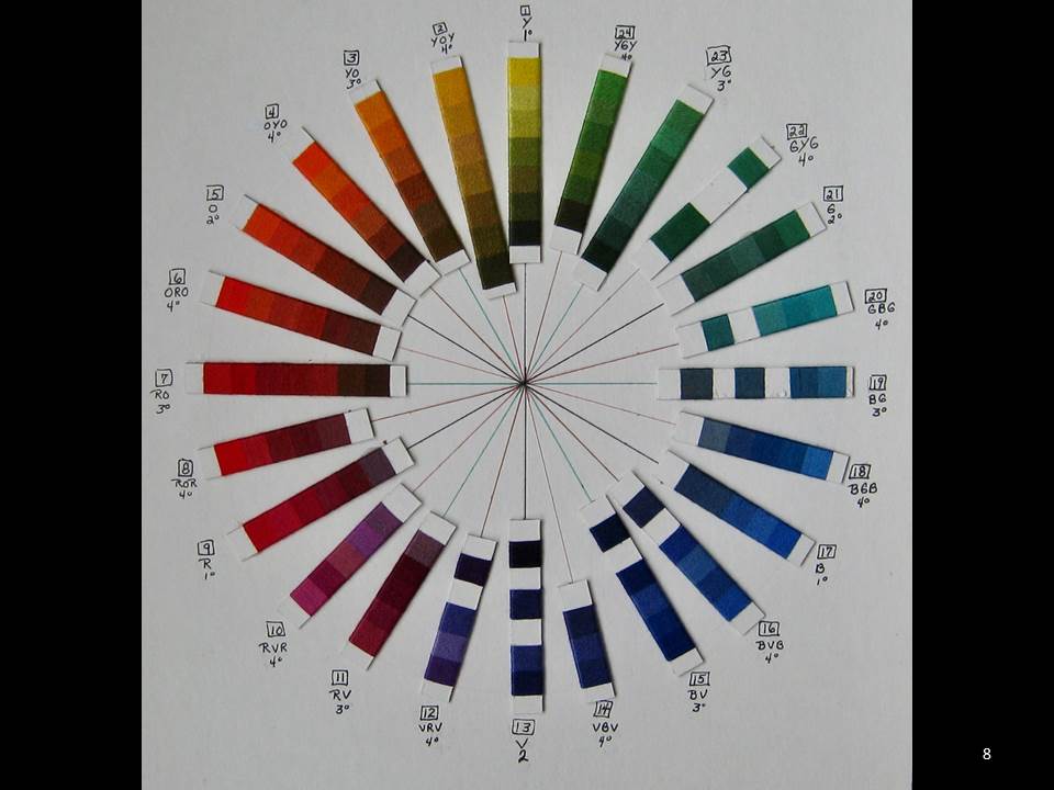
Color by Carol Lynn Stratton - 88. Color wheel: Mixing secondary and primary hues gives you tertiary colors. Generally these are shown in a ring or color wheel. There are many different color wheels depending on the medium being used and the artist’s preference. This is one I made with DMC and Anchor colors. The hue is given and numbered. Colored lines link up opposites.
