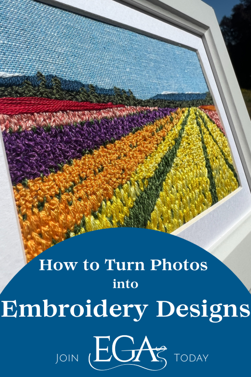
We’ve teamed up with talented embroiderer Rosanna Diggs to bring you a new tutorial on turning your photos into embroidery designs. This is part three of a three-part series.
Part 3: Bringing the Memory to Life: How to Choose Stitches to Amplify Details
If you’re just finding this series, I encourage you to read the earlier parts, here and here.
One of the most helpful things when you’re on an adventure is a map. For that, I print my source photo. Most importantly, I print it to scale. One of my personal limitations is I can’t look at something tiny and stitch it large and stay proportional. So I learned the hard way that I need to print to scale.
When I stitch, I usually want it to look realistic. So I think about how I see things and sort into layers. From there, I know I need to stitch the object farthest away first, and the closest items last.
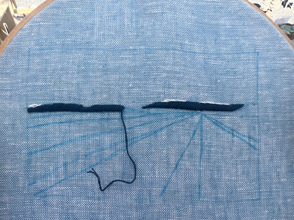
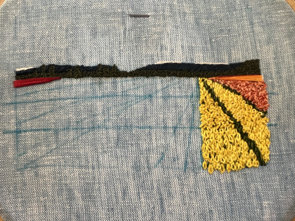
I chose to use 3 strands to Satin Stitch the mountains. I stitched at an angle to add depth. Three strands on Brussels Washer offers full coverage without adding bulky texture. I accented the mountains with 3 strands of blanc split stitched into place.
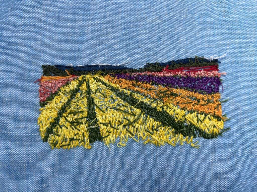
It’s rare that all my stitches are right the first time. You can see from the photo my horizon line is way off from one side of the mountains to the other. I had to pull one side and restitch. It’s good to get the mistakes out of the way first, right?
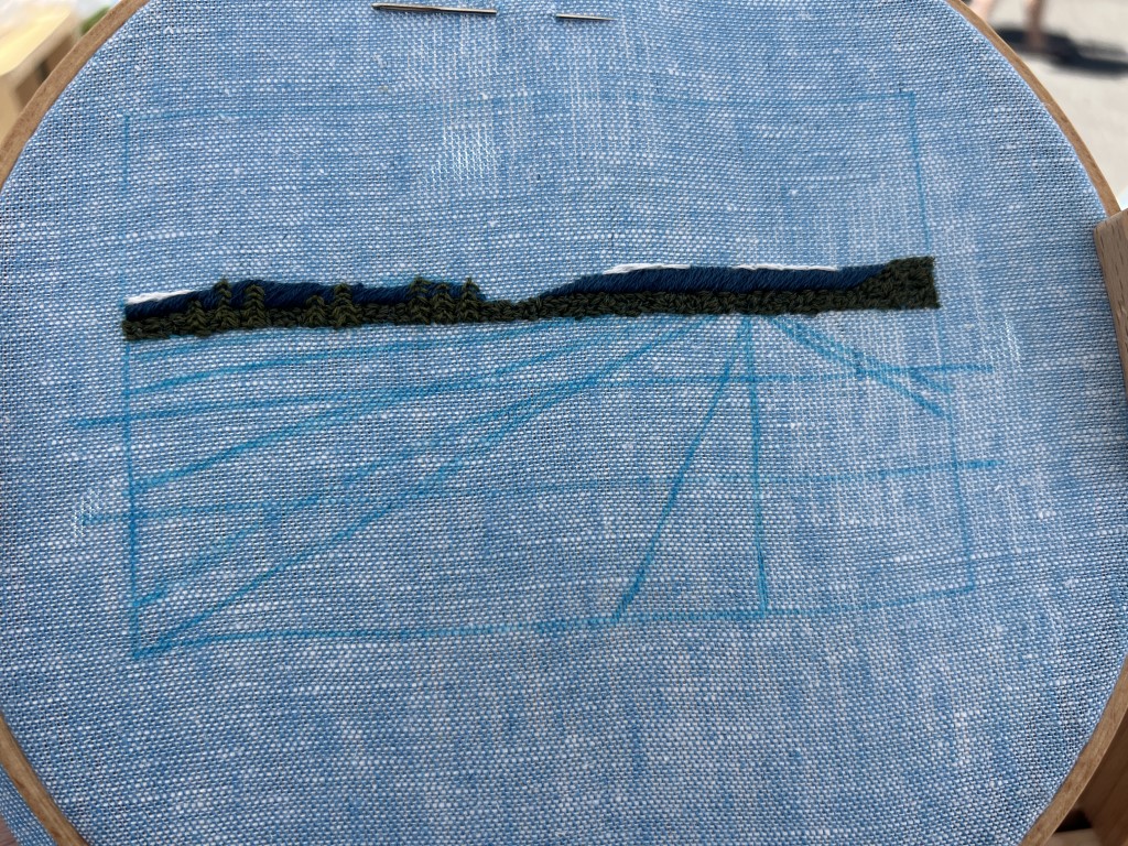
Next, I layered in the evergreens. I had selected two colors originally, but went with a single color since it’s so far away and depth of color is lost at that distance. This piece isn’t about the trees; they’re an accent. I used 3 strands of 935 to make the trees with fly stitch.
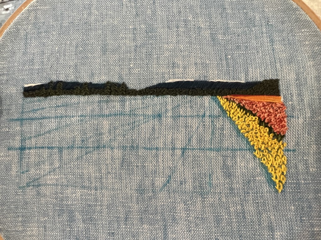
Next, I experimented with stitches to show distance, again using the rule of thirds.
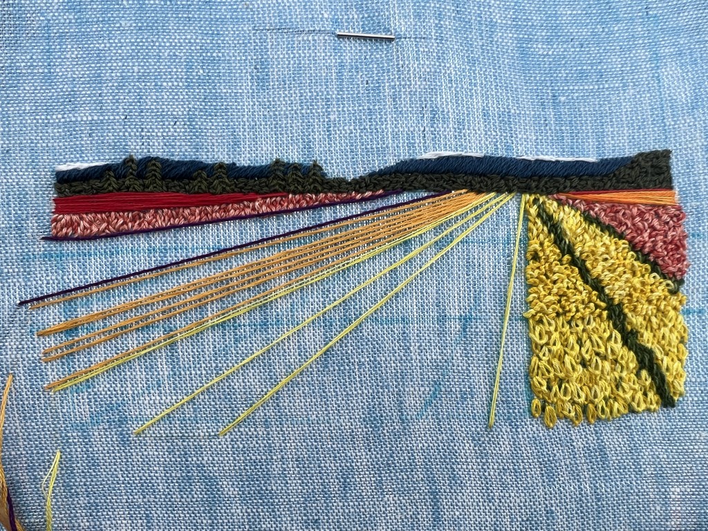
I chose to Satin Stitch 3 strands of 321 for a barely visible dark coral row, and then the same stitch for orange for the next farthest rows. I used thread blending for most of the stitching here on out, to add depth of color. My 3 orange strands consisted of two 742 and one 741.
For the rows with detail, the farthest section is made of Seed Stitch, the middle section is Peking Knots, and the foreground caused me grief, but it’s mostly Lazy Daisies.
For step-by-step instructions on how I create those stitches, check out my YouTube tutorials:
- My Seed Stitch YouTube tutorial link: https://youtu.be/wYymX-5FZVg
- My Peking Knot YouTube tutorial link: https://youtu.be/8N0sQuhIz84
- My Lazy Daisy YouTube tutorial link: https://youtu.be/ktyjAXs13TM
I blended 2 dark coral strands with one medium coral strand to stitch Seed Stitch at about half coverage in that section, then went back through and filled it all the way in by blending 1 strand medium coral with 2 strands light coral. I use that same 3 strand recipe, first darker then lighter, to fill the Peking Knot section.
After the coral is in place, I used 2 strands of 3345 and 1 strand of 3347 to delineate the grassy row.
Next, I wanted to make sure the yellows were going to work. I used 2 strands 444 and 1 strand 307 to seed stitch the far midground, then filled it in with 1 strand 307 and 2 strands 445. Rinse and repeat with Peking Knot.
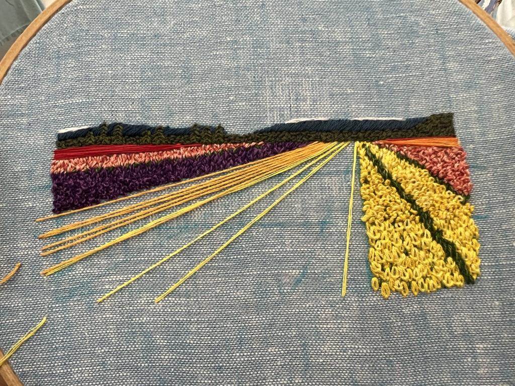
For the foreground, I tried lazy daisies, tulip stitch, straight stitches, and a combination of the three. In the end, I settled on lazy daisies with four strands – 2 dark, 2 medium, and then a second layer with 2 medium, 2 light.
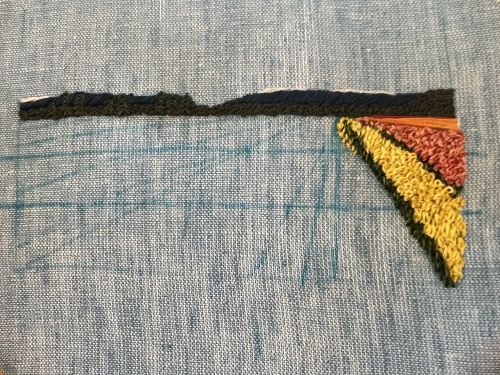
Follow that by delineating the grassy row, which I make throughout with 3 strands—2 of 3345 and 1 of 3347. I don’t increase to 4 strands in the foreground as I do for the petals because the grass is the accent, not the feature.
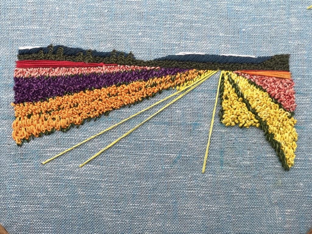
Here’s a close up of the section causing me grief. I didn’t like that the transition from mid ground to foreground got flatter.
I let that sit awhile and started from the left – I couldn’t go much further to the center yet anyways as front and center should get stitched last due to layering.
One of the color swaps I made was to eliminate the 321 for being too red and move the dark coral 351 to the upper left to balance the boldness of the orange, but also not clash with the lighter coral.
Next came a coral section to balance the coral on the other side, but not be quite even with it so it wouldn’t be all matchy matchy. It was at this point that I started getting my lines mixed up and forgetting which colors I really wanted where. So I took the time to install row markers (any gardeners here?) in the colors I planned for the rows. I also altered the rows some – I really didn’t want a huge grassy section if I didn’t have to. Turns out, I didn’t have to.
Purple was the only section I didn’t use three colors. The primary color of the tulips really matched 550, which is so dark that a lowlight is kind of pointless. So I only highlighted it and did a single trip through.
Slowly getting there with the orange.
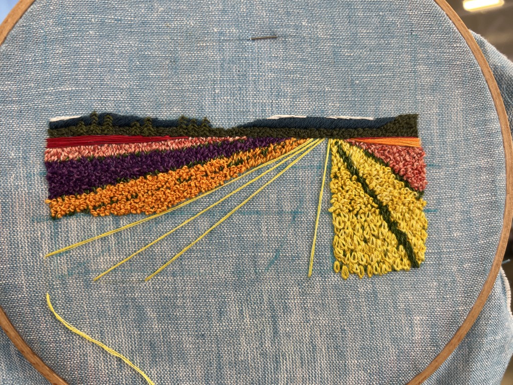
Once the orange was finished, I was ready to fix that yellow section to the right. I snipped it out for a fresh start.
It turns out, what I preferred for the foreground tulip petals was 4 strands.
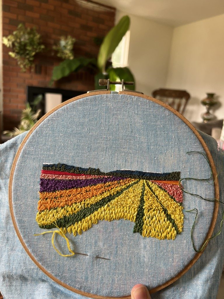
Once that decision was made, the rest of the stitching went very quickly.
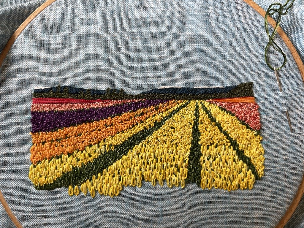
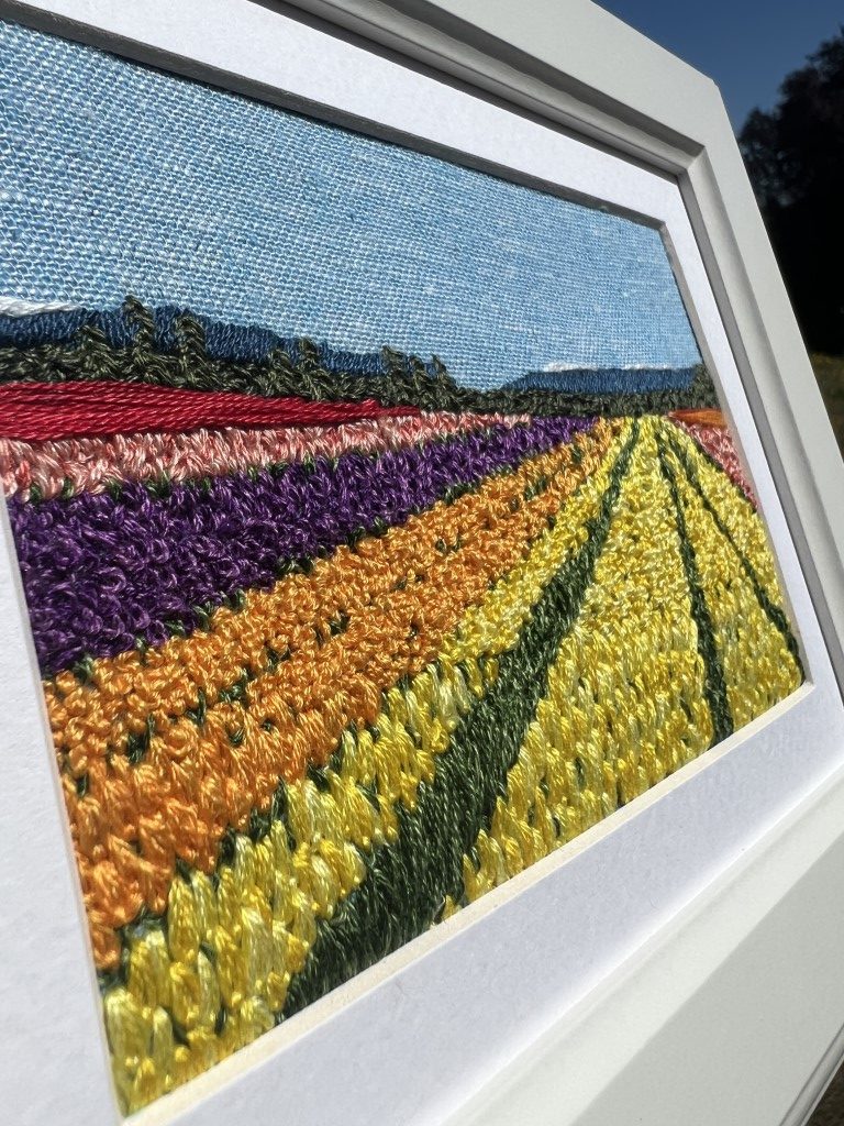
You’ll notice it’s quite uneven on the bottom. Over the years of doing custom embroideries and matting them, one of my least favorite things is to get to those final steps and realize I need a few more stitches to reach the matte. So as a rule, I stitch too much now, knowing it’ll get covered late.
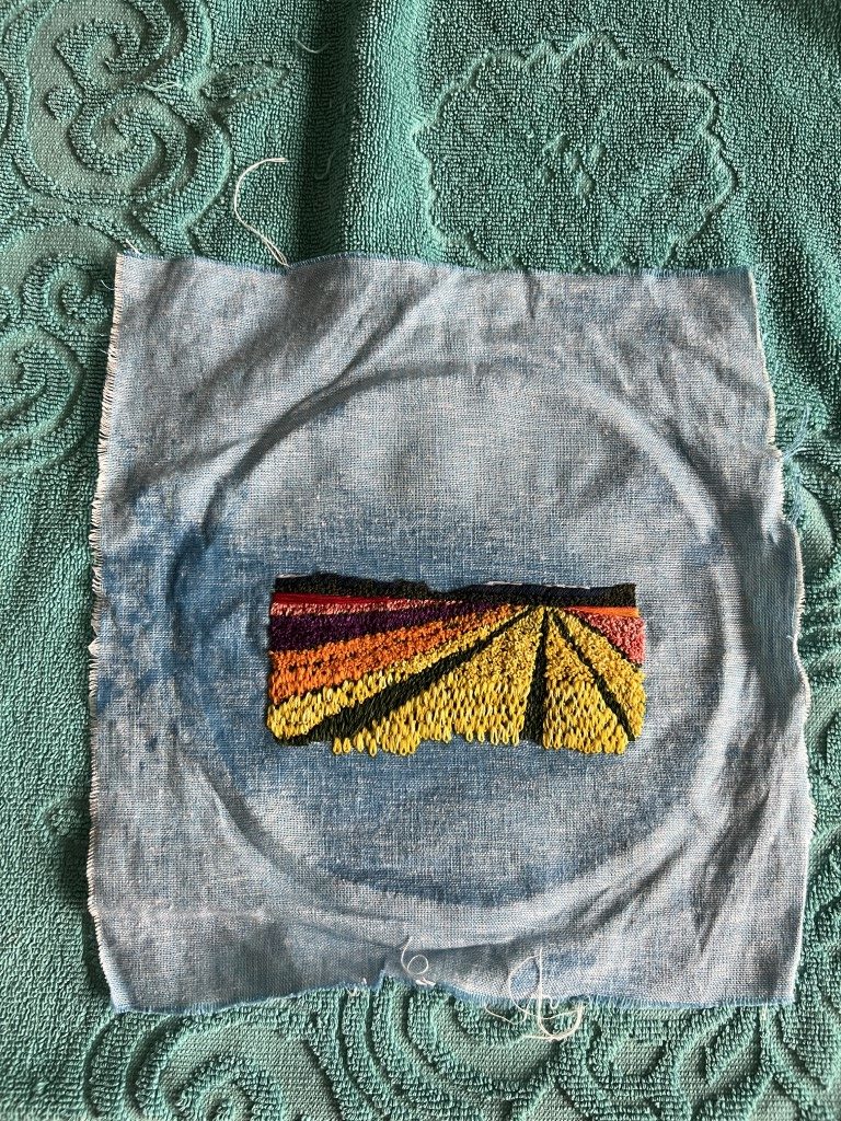
Once all the stitching is done, I unhoop my fabric and give it a rinse in running water to get all the blue marks out. The Leonis brand marker washes away so nicely, it doesn’t take much.
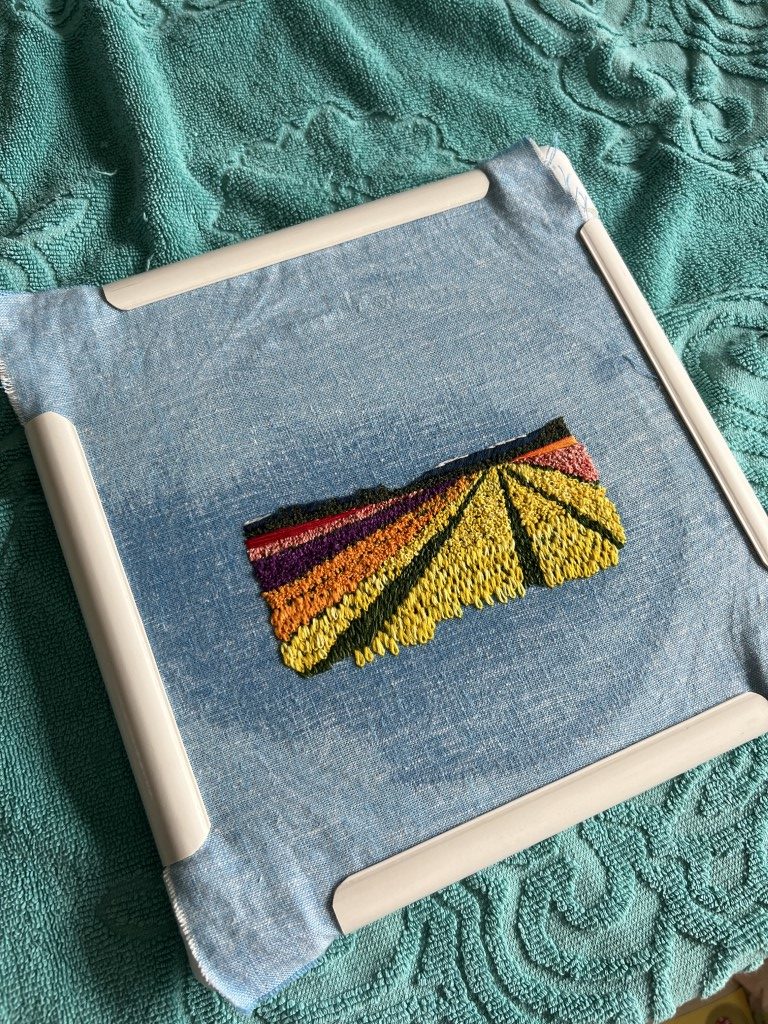
Once it’s washed, I frame it with my 12” square pvc frame. This lets it air dry flat so it’ll frame easily.
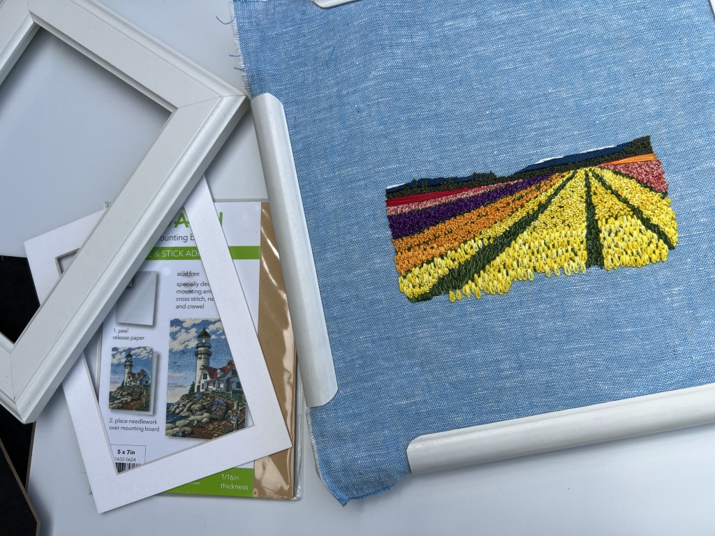
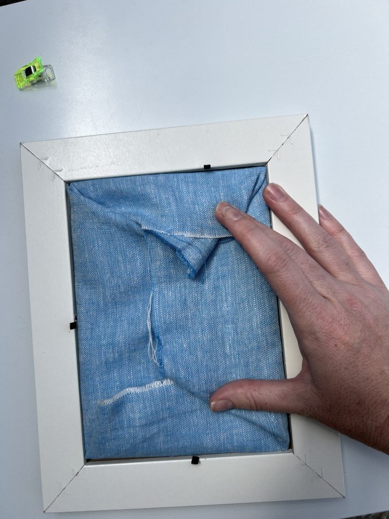
After the fabric is dry, it’s time to frame! This has always been a bit fiddly for me- I definitely understand why some folks take their stitching to the framers. With that in mind, my suggested supplies are: the matte, frame, sticky back board, Clover clips, and patience.
Step 1: I double check that the matte frames the embroidery and take a second to be grateful I stitched “too much” earlier. (If there were any fabric showing where it shouldn’t, now is when I would fill in with a few more stitches.)
Step 2: Lay the matte face down, with the fabric face down on it. Pause to appreciate that lovely backside.
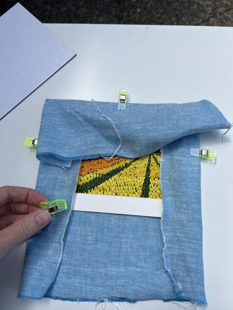
Step 3: use some Clover clips to hold the fabric to the matte how you want it to be framed.
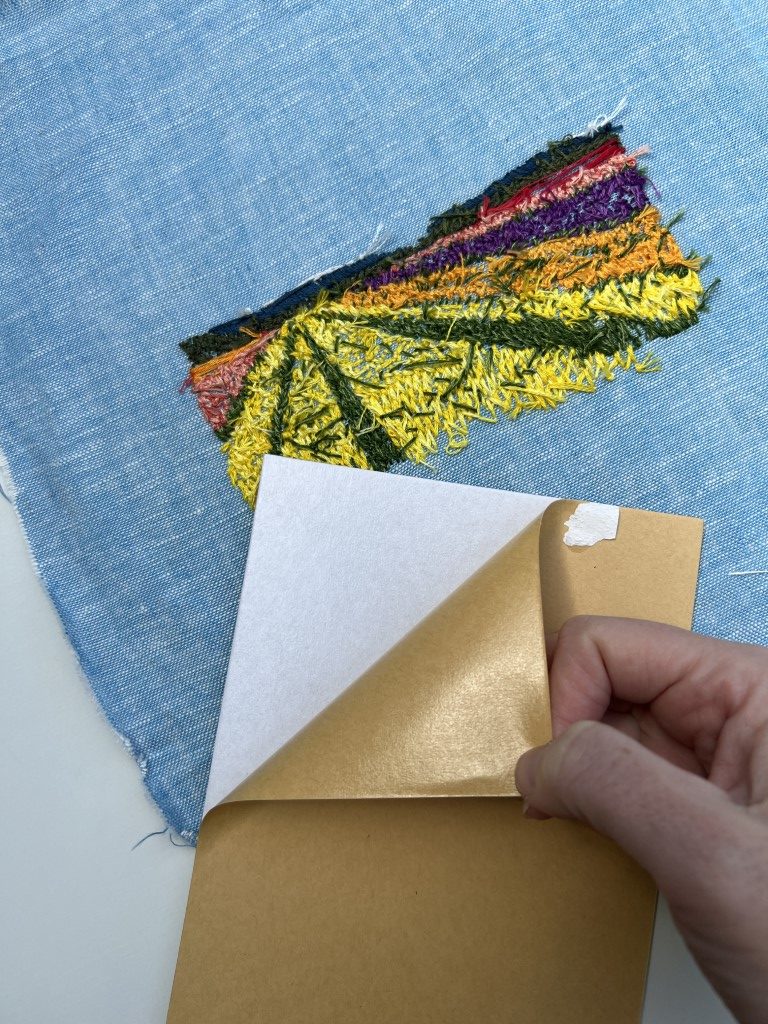
Step 4: Peel the paper from the sticky back board. Sticky back board (the official name is “Adhesive Lightweight Mounting Board”) is a thin cardboard that is not super sticky. When I’m eyeballing the matting, it’s very nice to be able to reposition my stitched fabric without damaging it.
Here’s the stuff I use: https://www.joann.com/adhesive-lightweight-mounting-board-5×7/16320624.html
Lay that on the back of the fabric and try to get it just right (you probably won’t- I certainly never do). Remove the Clover Clips as you do, so it can lay flat.
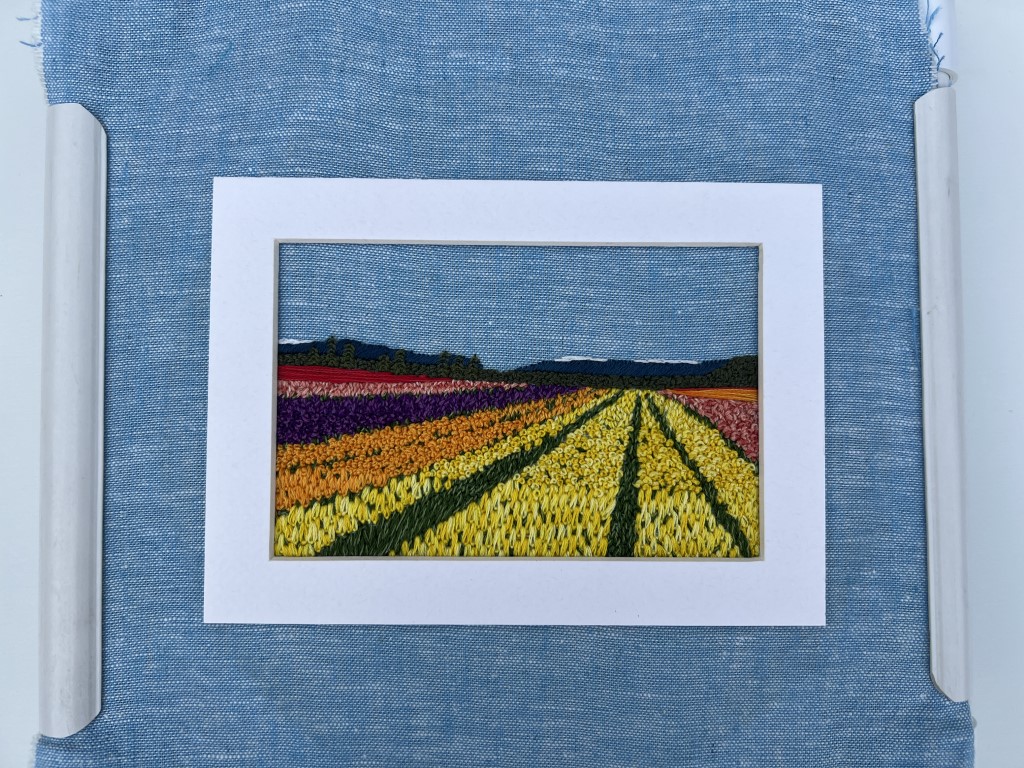
Step 5: Put the matte-fabric-sticky board sandwich into the frame and see how it looks. Repeat Step 4 until you’re satisfied.
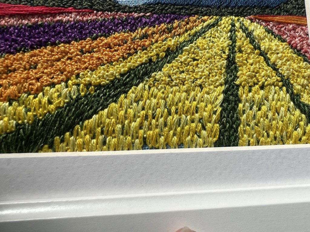
A close-up of why I’m really glad I put in those extra stitches – seeing those partial stitches peek up from the matting is just *chef’s kiss*.
Step 6: trim fabric as desired, or in my case, tuck it all in for later use, and put the back on the frame.
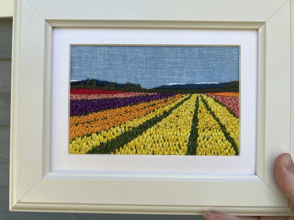
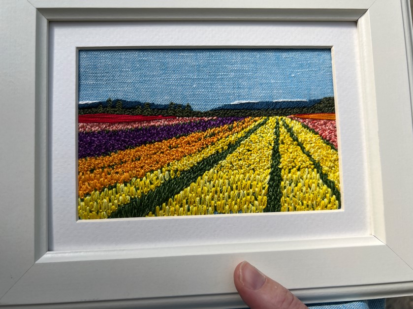
Step 7: admire all that beautiful work from all the angles.
Thanks so much for following along with this series. If you’d like to learn more about my work you can find me at www.rosannadiggs.com.
Happy Stitching!
— Rosanna Diggs, rosannadiggs.com
Like it? Pin it!