We’ve teamed up with talented embroiderer Rosanna Diggs to bring you a new tutorial on turning your photos into embroidery designs. This is part two of a three-part series. Subscribe to the blog here to make sure you don’t miss the upcoming part.
Part 2: From Adventure to Fabric: How to Transfer a Photo for Embroidery and Choose Materials
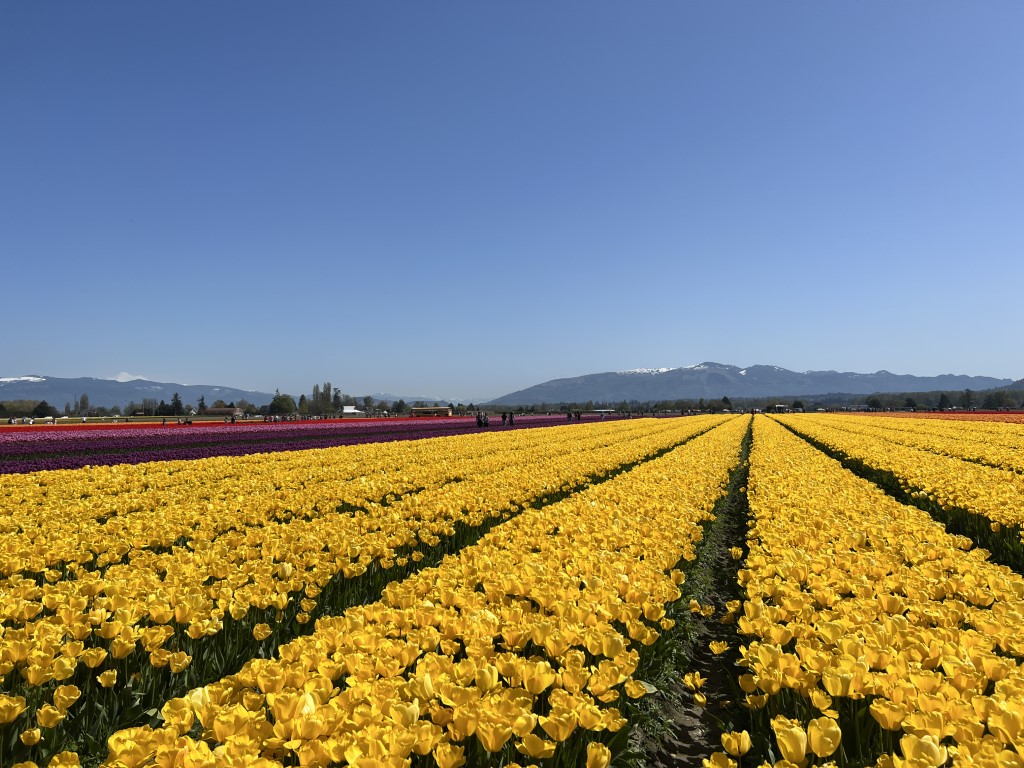
In the first part of this blog series, we went on an adventure and found a great photo to work with:
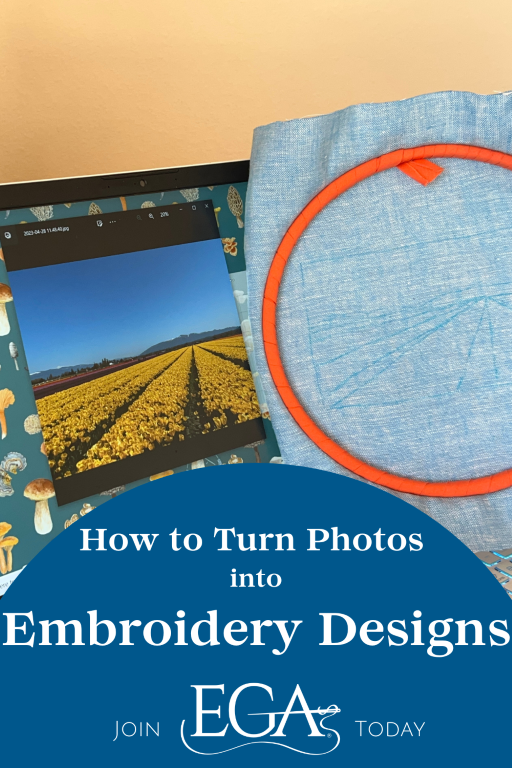
Today we are going to get that photo onto fabric and prep for stitching.
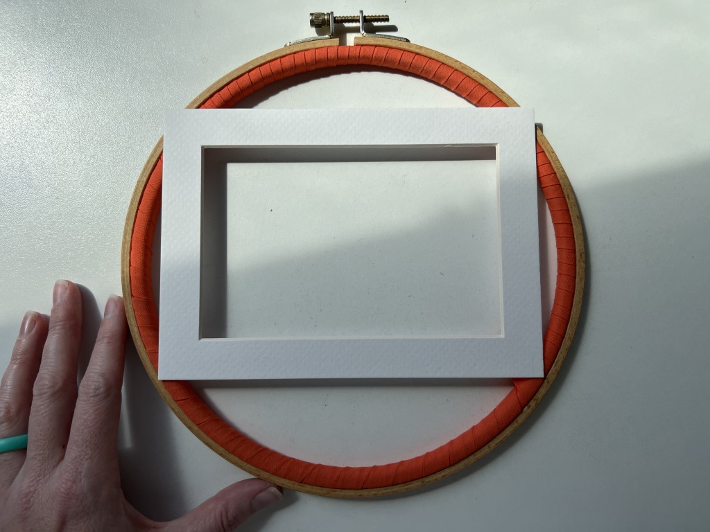
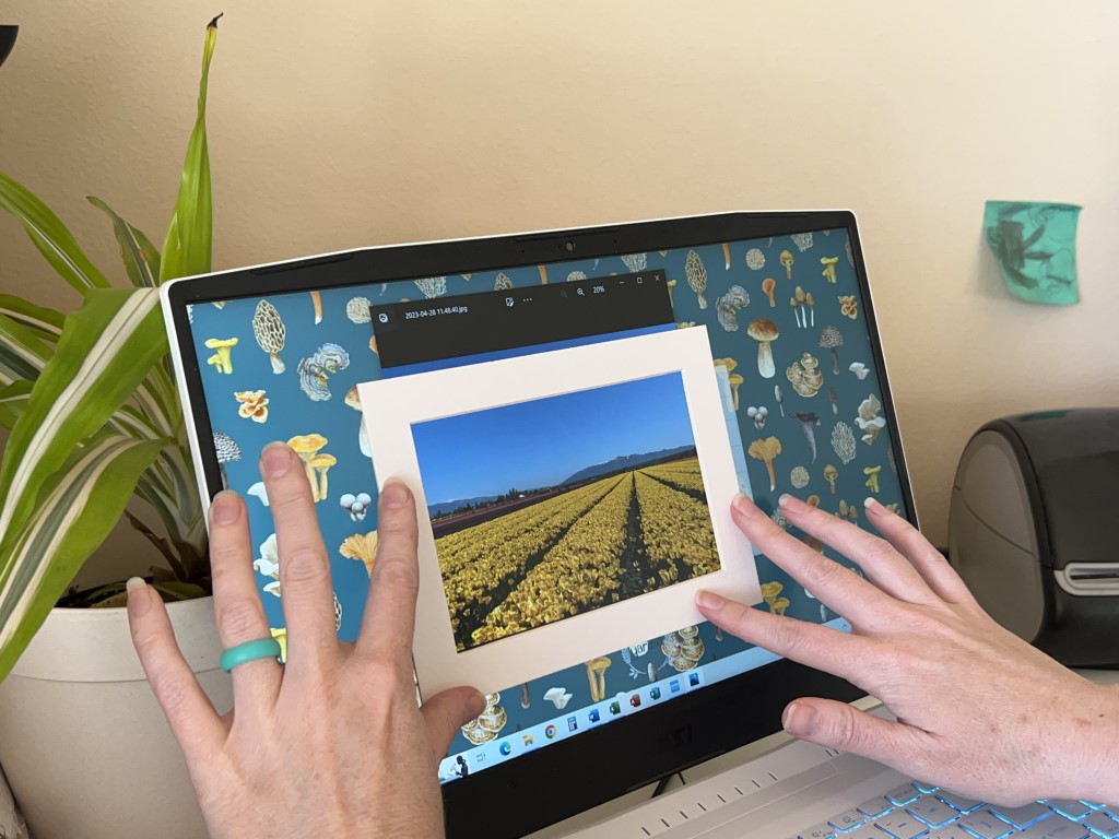
First, I decide which frame I want to finish the piece in. I decided my finished work would be 4×6 inches, matted white on white.
I had this frame handy so I went with it.
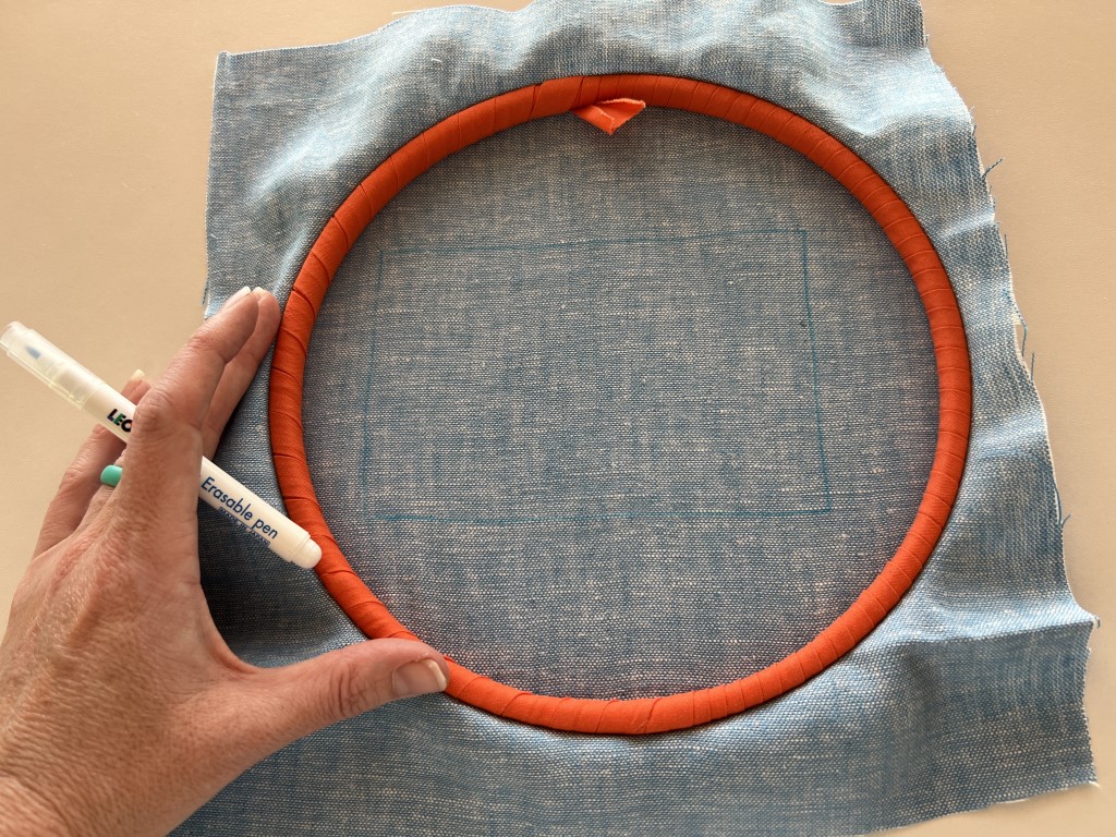
Bonus points for the whole design fitting in my favorite hoop.
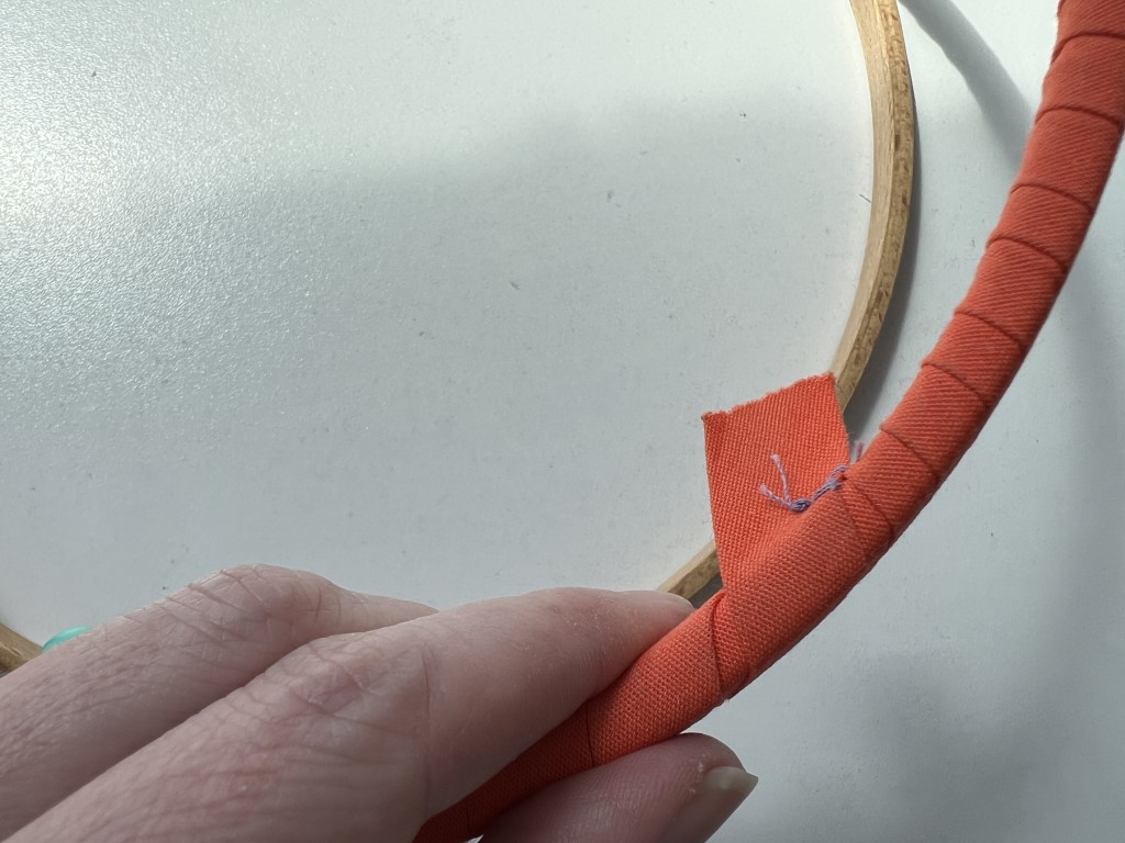
Tip: See that orange bias tape around my hoop? That’s twilling. I always use a twilled hoop when I’m working on large pieces. Larger hoops often don’t hold tension and this has proven an excellent fix. If only I had chosen a more photogenic color…
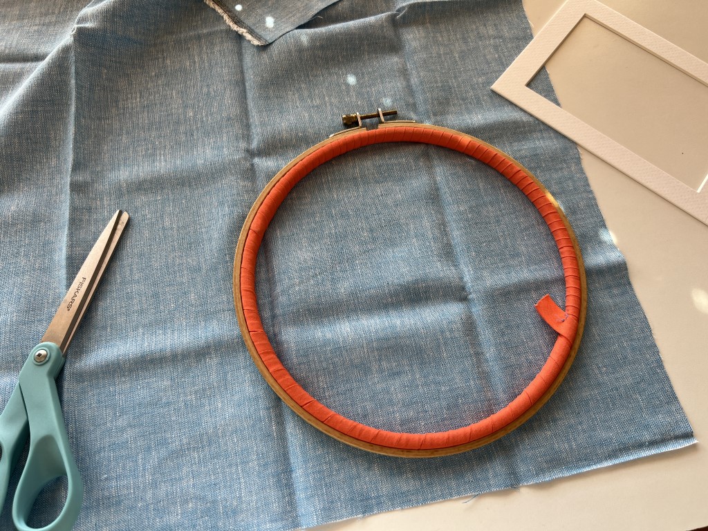
Fabric: I definitely want to acknowledge that perfect blue sky, but it was SO smooth, I felt less was more. So I pulled up some blue Brussels Washer for my background fabric.
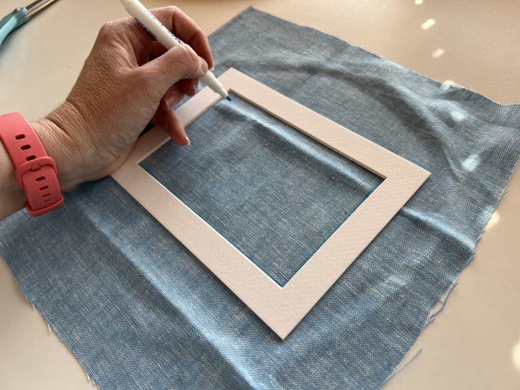
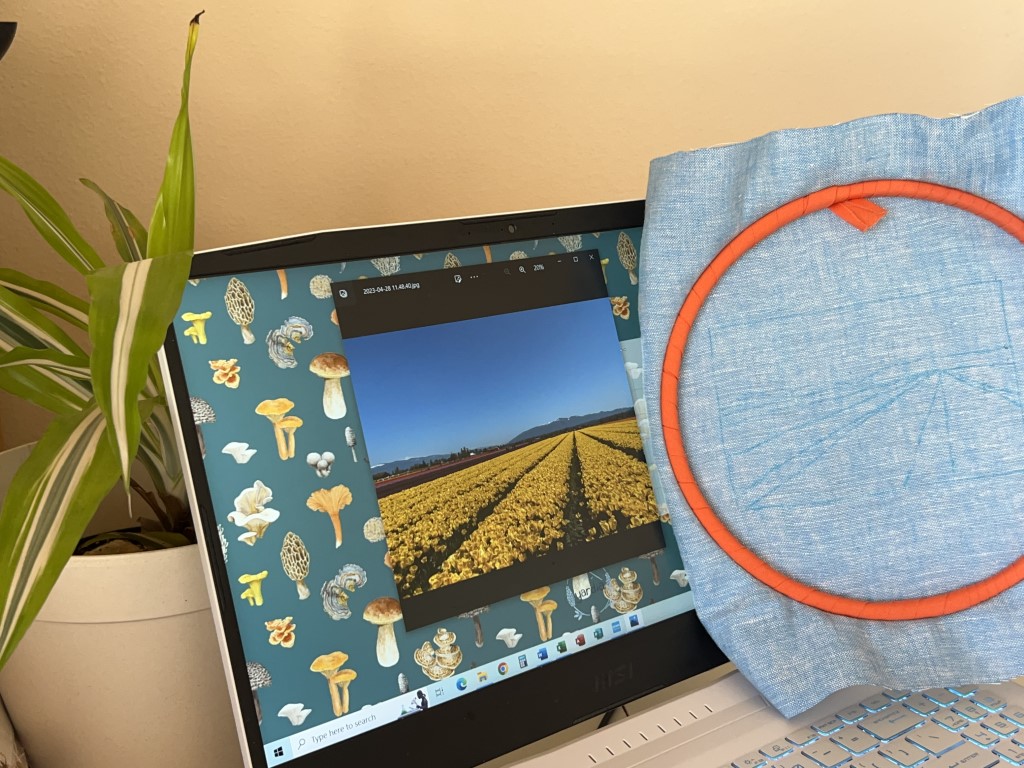
I use my water soluble transfer pen to trace the 4×6 outline from the matte to the fabric so I make sure I’m working in the right area. I strongly prefer the Leonis brand transfer pen. They write really smoothly, have plenty of ink, and the tip holds up very well.
Next, I hoop my fabric. I choose to do this prior to tracing for multiple reasons – 1. My fabric already has the tension I want on it when I trace so the design doesn’t distort. 2. I’m going to be holding it against a computer screen, so I want it to not flop around.
Then, I use my matte to really zone in on what I want my finished piece to look like. I pull the photo up in Photos and adjust the size from there.
One of the most important composition rules my high school art teacher (Hi, Mrs. Billings!) taught me was the rule of thirds. When I’m designing, I imagine the piece divided in three vertically and horizontally.
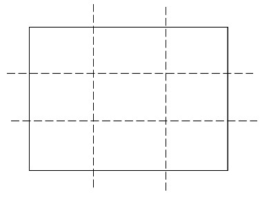
From top/far away to bottom/up close, we have background, midground, foreground. And whatever our main attraction is in the photo—kudos to you if you can get it really close to one of the four spots where lines intersect. For my tulip fields, it’s going to be where all those rows meet on the horizon. My top line is going to be the horizon line, and I’ll mark the bottom horizontal line to help me with stitch choice later.
When I’m happy with what the composition is going to look like, I hold the hoop straight to the screen (Tip: turn the brightness all the way up!) and sketch the important things. In this case, it’s the silhouette of the mountains, the horizon line, and the angled lines of the rows.
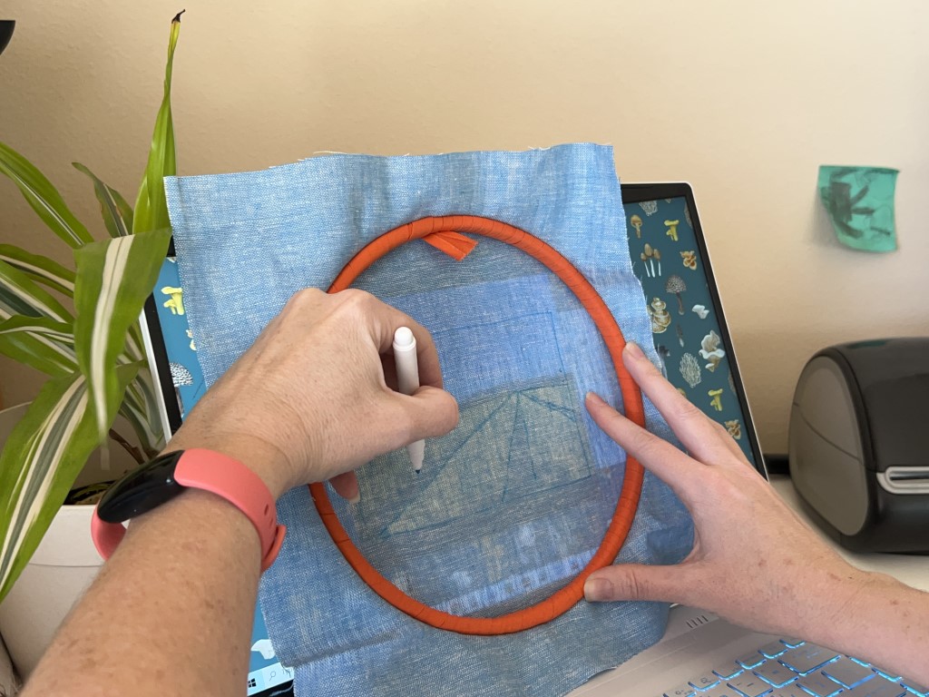
It doesn’t look like much now, but that’s really all we need for tracing on this one.
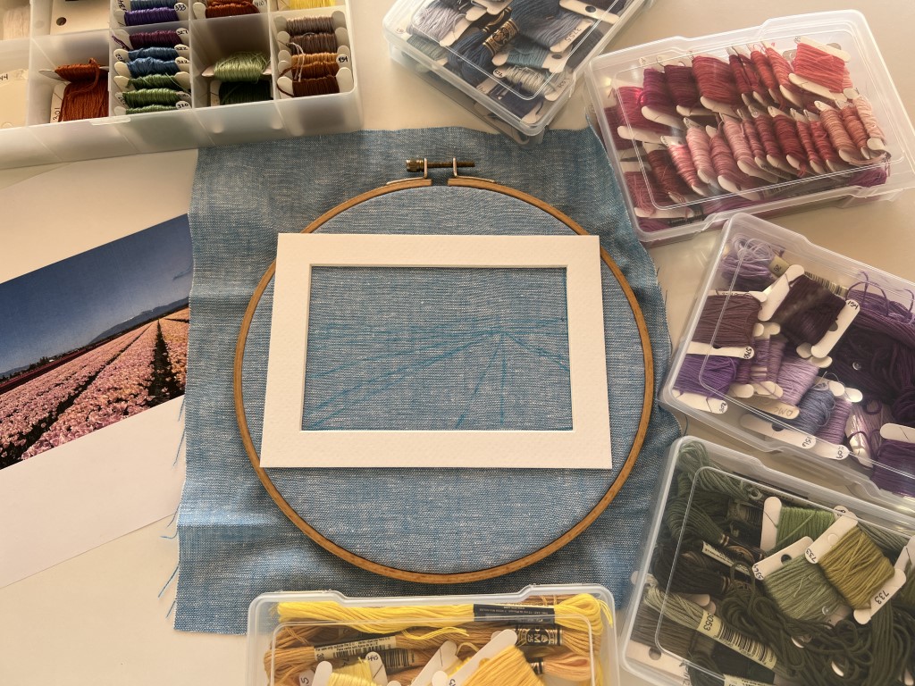
I go ahead and rehoop my fabric with the design facing up. We are about to select colors and I don’t want my gaudy orange twilling to impact my choices!
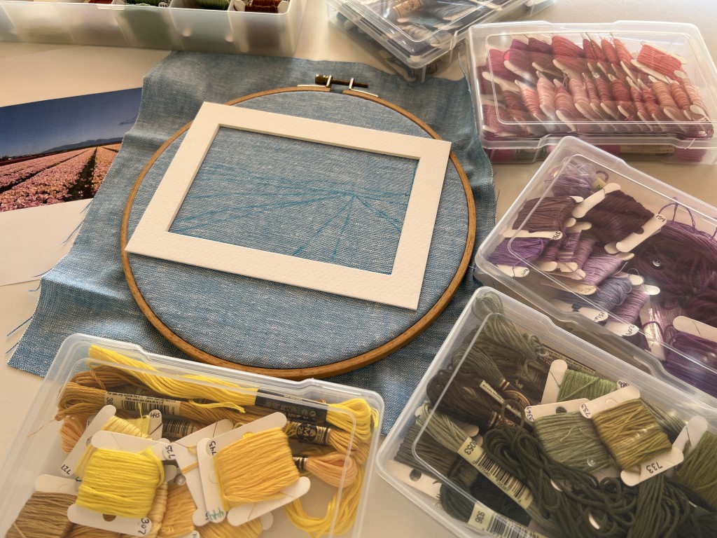
Organization tip: Try organizing your floss bobbins in clear photo boxes, sorting the bobbins by color. Lately I have switched to keeping all my floss bobbins in clear photo boxes organized by color family. I really like order, so not having them organized numerically felt messy – until it proved really helpful for this project.
How did I choose colors? At the higher composition level, I love those white flowers but I didn’t want any white in the field to detract from the snow capped mountains. I also love the yellow but wanted to represent more of the colors at the farm – our last trip there the coral tulips really spoke to me so while they aren’t in our chosen photo, they will appear in my finished piece. And staying with the warm side of the color wheel, letting some of those yellow rows be replaced with orange rows adds interest. Yellow and purple are opposites on the color wheel, which makes them complementary. This felt like a good way to accent, by putting them next to each other.
Tip: Consider consulting a color wheel when selecting colors for your own image to create more contrast and complementary color choices.
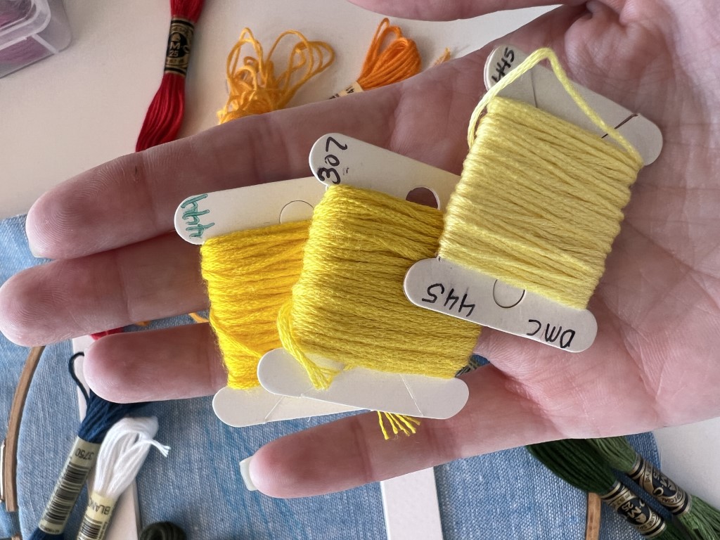
As for choosing colors at a more specific, floss level, this comes in part with experience. For example, while walking through the purple tulips I found myself thinking “that looks like 550!” and in the yellows, “oh, 307 is going to be the base for those.” And I happen to know those colors look amazing stitched together. So I definitely had a starting point, but maybe you don’t.
Tip: Back when I didn’t have every DMC color memorized, my method was to take my threadbox outside and look at them in the best daylight possible. I encourage you to do exactly that. I would start with which colors needed to be most true to the photo/memory and find those. (So, I picked my yellow as 307, my orange as 741, and my purple as 550.) Then, find colors that represent the secondary elements that also look good next to the already selected colors. 3345 might not be the perfect color for tulip leaves, but it pairs extremely well with all three of those colors I already picked.
If you recall from the notes I took in the tulips, the flowers had so much color depth. I knew I wanted to represent that with choosing three colors of floss for every color of tulip. A good rule of thumb is to supplement your main color with two similar colors of high and low values. For example, for my yellows, my main color is 307, my highlight is 445, and my lowlight is 444.
Here is the pile of colors I decided on:
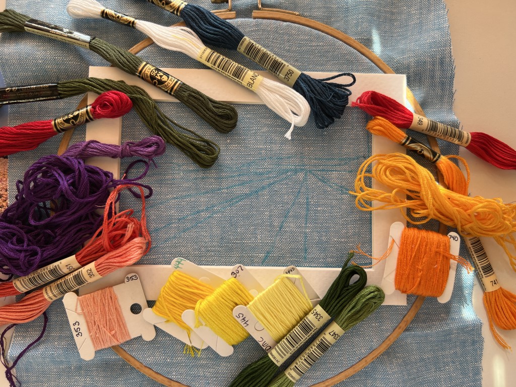
I chose to finish stitching this piece before writing because inevitably, things change while stitching. At this point in the game, my plan was, clockwise from noon:
- Mountains – blanc and 3750
- Dark coral, 349
- Oranges, 740, 741, 742
- Stems and Leaves 3345 and 3347
- Yellows, 307, 444, and 445
- Corals, 351, 352, and 353
- Purples, 550 and 552
- Red, 321
- Evergreens, 935 and 936
And now, we are ready to stitch!
— Rosanna Diggs, rosannadiggs.com
See Part 3: Bringing the Memory to Life: How to Choose Stitches to Amplify Details | Subscribe to the blog here.
Like it? Pin it!